September 5, 2018:

The date that Psyonix launched the first Rocket pass. This saw a bunch of new items enter the game that you could attain by leveling up through the XP system. Since then, there have been 18 rocket passes - each with a completely new set of items.

The consistent release of new content is great for players and the game, but it comes with its own set of issues. The inventory system did its job perfectly fine when the game was first released. Most of items that players got from playing were usually traded in for higher tier items with a 5:1 ratio which kept inventories relatively condensed. However, with the introduction of Rocket Pass, inventories get more and more flooded each season.
It doesn't take a UX designer to realize that this could be improved
Ease-of-use aside, I also thought there was more potential to make the experience of changing your car more engaging. Currently, it feels a bit plain because there isn't much different than the other menus, and the UI is very bare-bones.

Bringing back old-school vibes

The first thing my mind went to was customizing cars in games centered around cars. Games like Forza, Gran Turismo, and Need for Speed are all very well known for their in-depth car customization, but they also make it an experience in and of itself. I wanted to bring at least a little bit of this type of energy over to Rocket League to make it feel more substantial to just sit back and design a car that's your own.
Need for Speed Heat
Gran Turismo 7
Forza Horizon 5
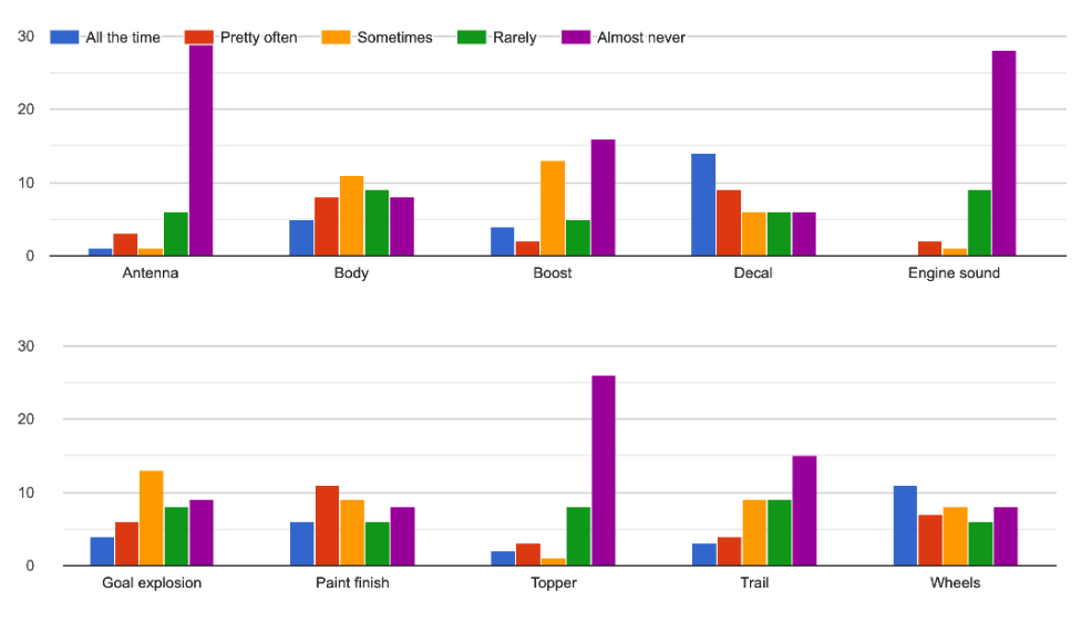
For the most part, I kind of just made the design. There is a survey which informed an important decision that you'll see, but besides that I just went with my gut feeling for all of the design on this. It's easy to get caught up in ideation, so I wanted to see what I could make if I just went for it.

Condensing the inventory

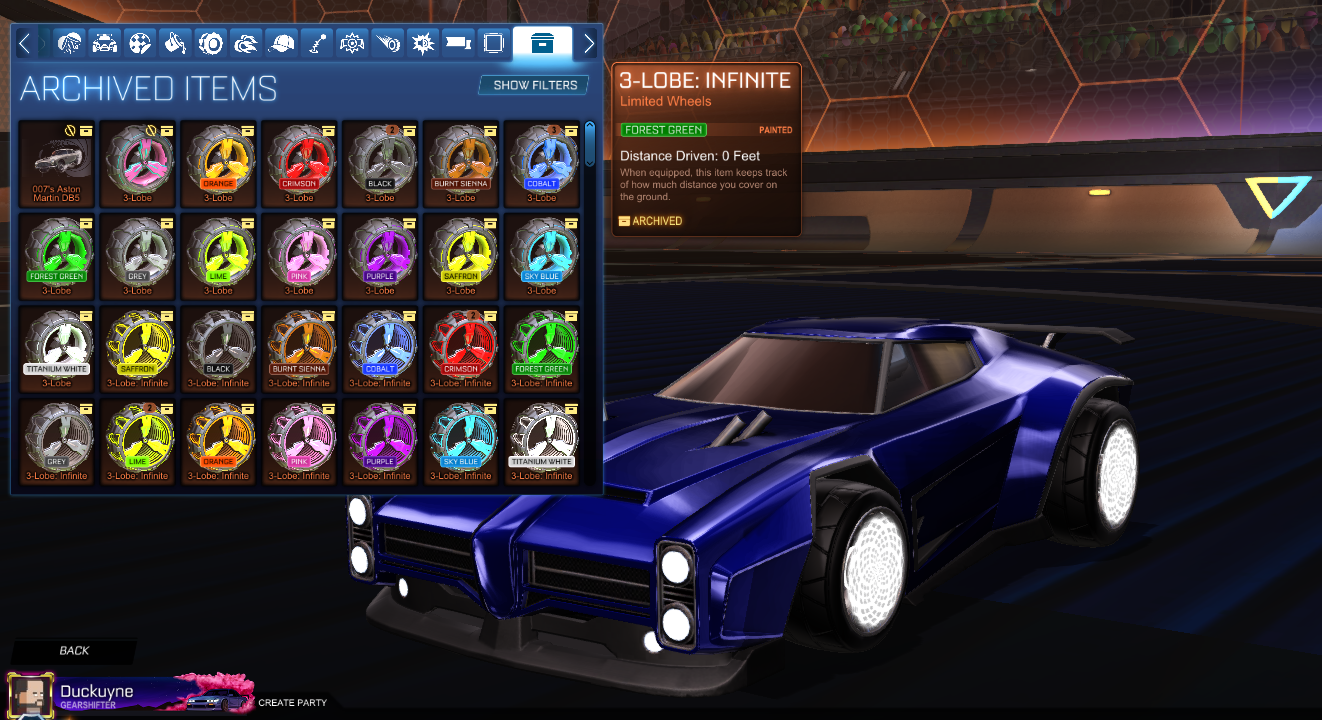
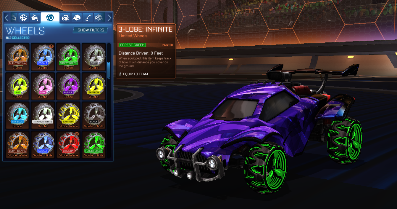
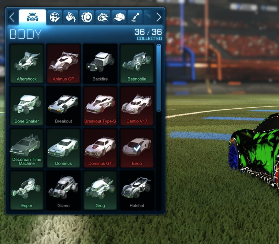
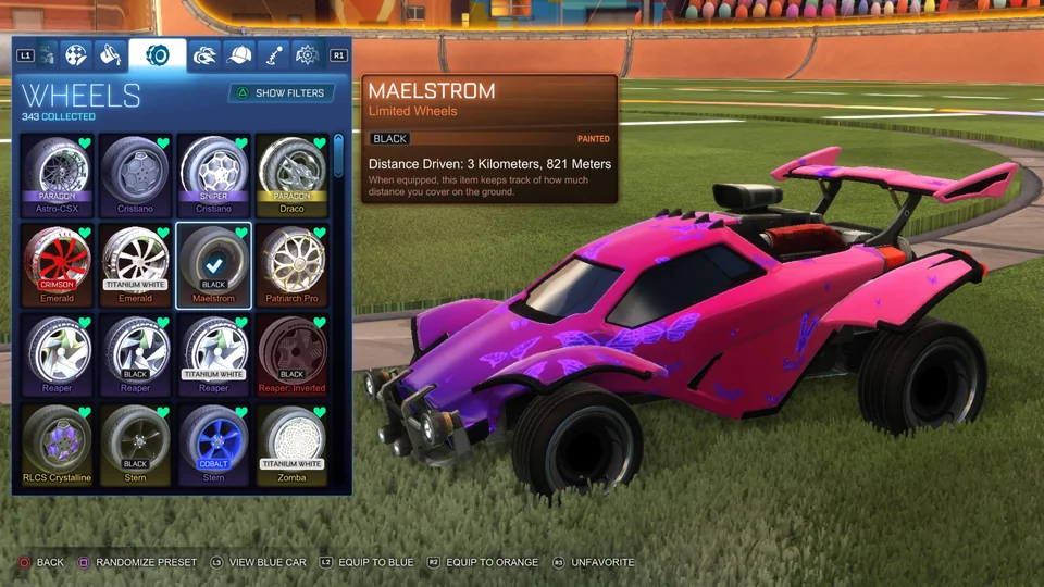
Functionally, the biggest difference I made is that painted and certified items get put into one card, where as before, they took up many slots as seen in the first inventory screenshot from above.
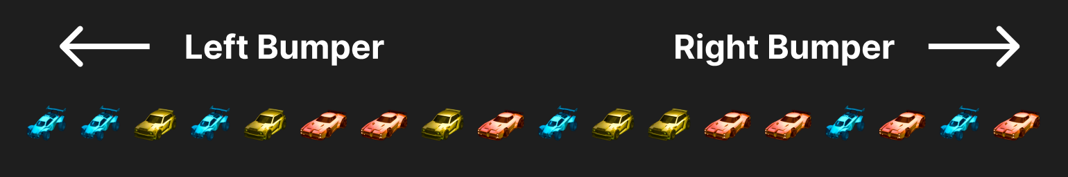
Painted Items

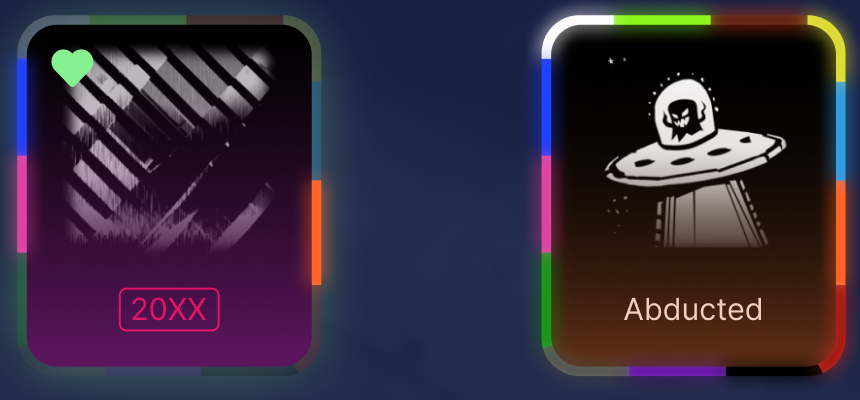
Left: An item that only has the blue, pink, and orange painted available.

Right: An item that has all painted colors available.
Painted cards are radial menus with areas active respective to the colors available. To select a color, the player holds the select button and moves the joystick in the direction of the color.

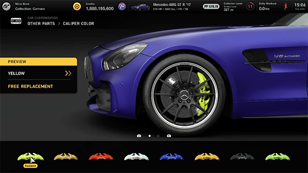
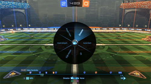
The picture on the right is a similar UI function that Rocket League already has in the replay mode.
It's hard to say how this would affect usability when all colors are available to choose from because there would be a small window for selection. However, players rarely have all colors of one item at the same time - especially of items that they use frequently.
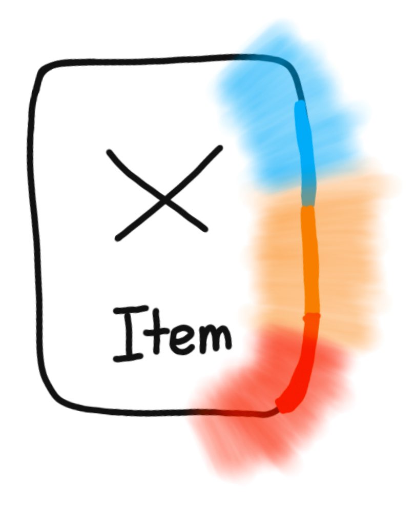
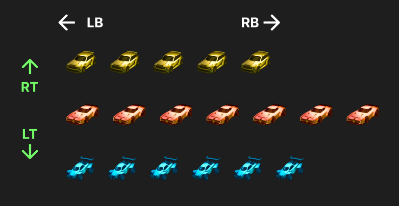
In the majority of cases, this means that the selection windows could be modified to be larger than the visual representations like shown above. (transparent is selection hitbox and solid is visual mark from above)

End Effect

By placing colors in a consistent matter around the outside of the item, players can commit their favorite colors to muscle memory so it's easy to select each time. It's also much easier to see at a glance which colors you do and don't have because it's consistent and there is a smaller area of the screen you need to scan (one card compared to 13 if you have them all).

Another big difference is that there is a sense of progress when it comes to collecting all of the colors for an item. Currently, you only see what you do have, but with this design you can also point out the colors you don't have and feel the satisfaction of completing the ring on the outside.

Certified Items

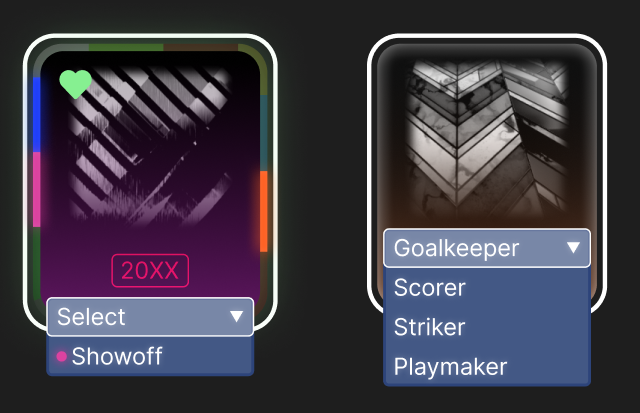
Left: The pink dot next to "Showoff" indicates that the certification is tied to the pink-painted decal.

Right: The player is only has certified versions of the decal so they are forced to pick one if they don't want the default.
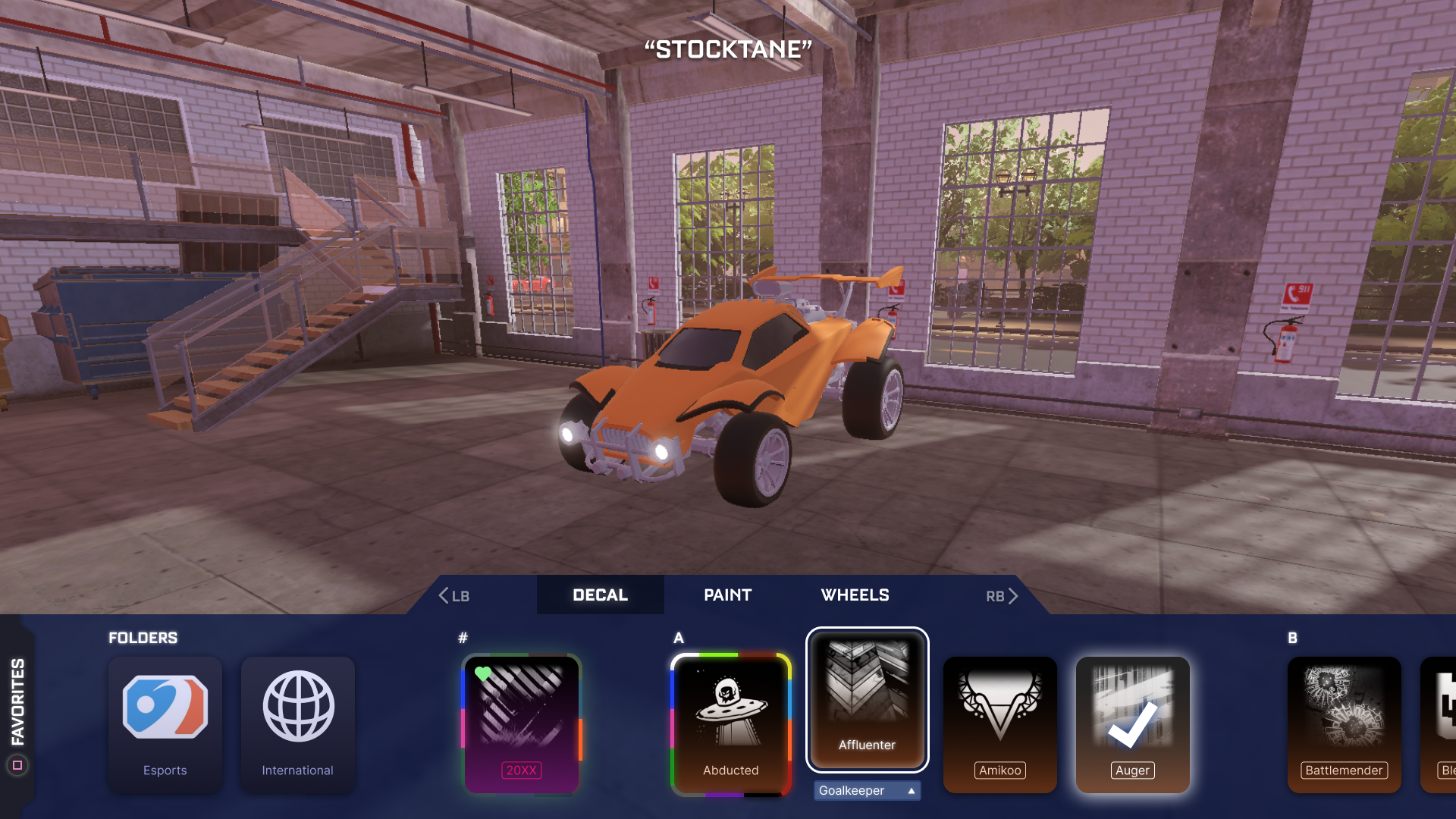
If you have a keen eye, you may have noticed some items in the original screenshot had a box around them while others didn't. The box (also seen on the "20XX" directly above) indicates that there is a certification available for the item. Although it probably won't be important to many players, it made sense to give it some visual indication since there was one for painted versions. It would also seem odd to have to select an item to see if it comes certified or not.
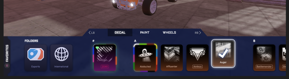
More Navigation

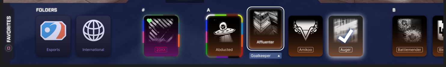
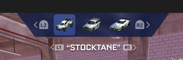
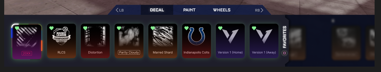
Items in Rocket League are already sorted alphabetically, but it's easy to get lost where you're at. I added extra separation between each letter in the alphabet so it breaks it up a little more and makes the inventory easier to process. I also imagined that you could use the right/left triggers to navigate through each letter: right trigger skipping one letter to the right, and vice versa. This means it would only take 26 "steps" to reach the end of the inventory which is faster than dozens of rows in current flooded inventories.

Being able to scroll through the inventory...

is not only more efficient when trying to find a specific item, but it also makes the experience more relaxed. Because the player doesn't need to worry about scrolling through a block of 27 duplicate wheels, they can look at the car when finding wheels instead of looking back at the item cards on the bottom each 10 seconds to find the next one that's different.

Since scrolling through is more enjoyable, it creates a more exploratory experience which coincides with the mental model I wanted for players treating car customization.

Condensing the menus

There are a few big navigational changes when you first enter the customization screen that I will talk about one by one. The core idea behind most of them involves the psychological idea of chunking: splitting up one big string of information into smaller ones.

1. Main customization tabs

The image on the left shows what tabs look like currently. You can see the icons that transfer to the three categories in my design. The main issue I find with this I figured many people only use half of these categories regularly. Because they're all dumped into one tab system, it's hard to remember which is where because it's a lot of information to process at once
To confirm my suspicion about how often each category actually gets changed, I sent out a survey on the Rocket League subreddit and to some friends in a Rocket League Discord server that I'm in.

I asked "About how often do you edit the following customization aspects" and there are some clear takeaways.
  • Antennas, Toppers, and Engine sound almost never get touched
  • Decals, Paint finishes, Wheels, and the Body get changed all the time

Here are the changes that reflect these results:

When you jump into any of the categories, the tab system works like this:
The three categories get cycled through with the bumpers just like before, so it will be familiar to anyone already playing the game. By splitting the three categories into categorical chunks, it's easier for players to map where each stylistic change is.

Not only are they split into chunks numerically, but categorically as well. The "special effects" includes boost, trail, and goal explosions: all elements that are external to the car and particle effects. The accessories are parts attached to the car, but not necessarily changing the car itself. The primary aesthetics are... primary. They get changed the most often and they're also conceptually similar. You don't need to play Rocket League to conceptualize how wheels and paint are categorically different than antennas and toppers.

2. Changing the body

Currently, changing the body is the same to changing all of the other customization aspects, but it's conceptually a bit different than changing something like the wheels or decal. Since the body has a functional effect to gameplay (a different hitbox) it's changed in different circumstances. The car is usually decided first, then the aesthetics are decided based on the car body.
This is what it feels like to switch presets in Rocket League right now. Each car represents a different preset, and the presets with the same body are colored the same to show something related to a bit below.

In Rocket League, presets are organized by the time in which they were created. Each time you make a new preset, it gets added to the end and there is no way to change it's position in the list. This means that presets with the same body get thrown everywhere and it's difficult to remember where your presets are at.

My Solution:

Now, presets of the same car are automatically grouped together and you can cycle through each body-type with the right/left triggers in addition to the bumper (pictured below).
If you want to preserve the aesthetics of the car and edit the body, you can choose "change body" as seen on the picture on the left. However, when most people change body, it's to a different preset all-together. This new system removes the guesswork of clouded inventories since many people don't delete presets with they stop getting used.

3. Easy access to favorites

Another big navigational aspect I wanted to talk about was favorited items. If you've read this far, something you might've thought about was why would someone want to scroll through the entire inventory to find something they use often.

Currently, Rocket League has a favorite system that pins the items to the top of the scroll window like this:
It works well if you only ever use favorites, but what happens when you venture to the rest of your inventory and want to access the favorites again? If you're using a mouse and keyboard, you can drag the scrollbar to the top, but if you're on console you can't do that. It's also frustrating to put the controller down because you need to use the mouse.

My solution:

Instead of being pinned at the front, I made a pull-out menu that gets opened by pressing a button on the controller. This allows you to access favorites from anywhere else in the scroll menu and easily go back to where you were after it's closed.