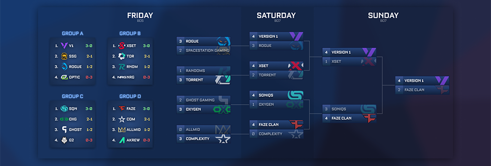
9,510,377 Hours Watched
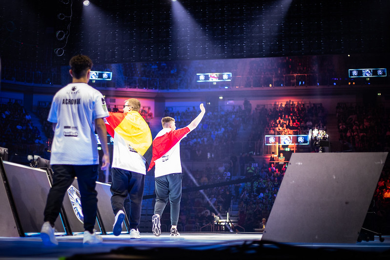
during the 2023 Rocket League World Championship
Since debuting in 2017, Rocket League esports has been growing and growing - now into a global ecosystem. While it continues to gain traction through its intense gameplay and easiness to watch, it still remains as difficult to keep up with outside a match as it was years ago.

There is no 'official' way to keep track of what's going on.

But fans still find a way...
Here are the three main methods fans like myself use to follow the scene.
The most important piece to Rocket League Esports
  • Schedules for tournaments
  • Team information
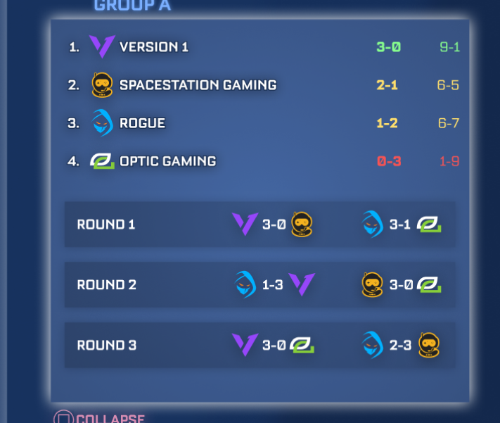
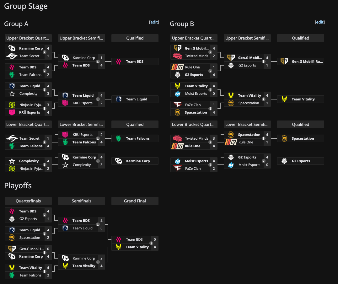
  • Track brackets live during tournaments
Biggest source of community engagement
  • Official updates from Rocket League, teams, and players
  • Platform for fans to interact with each other and community leaders
  • Ties together platforms like Liquipedia and Octane
  • Articles on current events
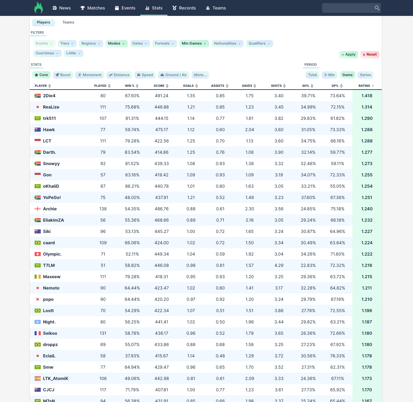
  • Large database of stats
Except for official Rocket League Twitter posts, everything listed above is fully done by fans that volunteer their free time.
Although they do a good job, the esport is now at a point more than ever where official infrastructure is needed. Liquipedia, Twitter, and Octane engage the fans that are already interested, but it's hard to draw in new ones - especially when there is nothing in Rocket League pointing you to these sources.

To help me think of what could help Rocket League fans stay updated...

I looked at websites for some of the most popular leagues in the world.
nba.com
nhl.com
nfl.com
premierleague.com
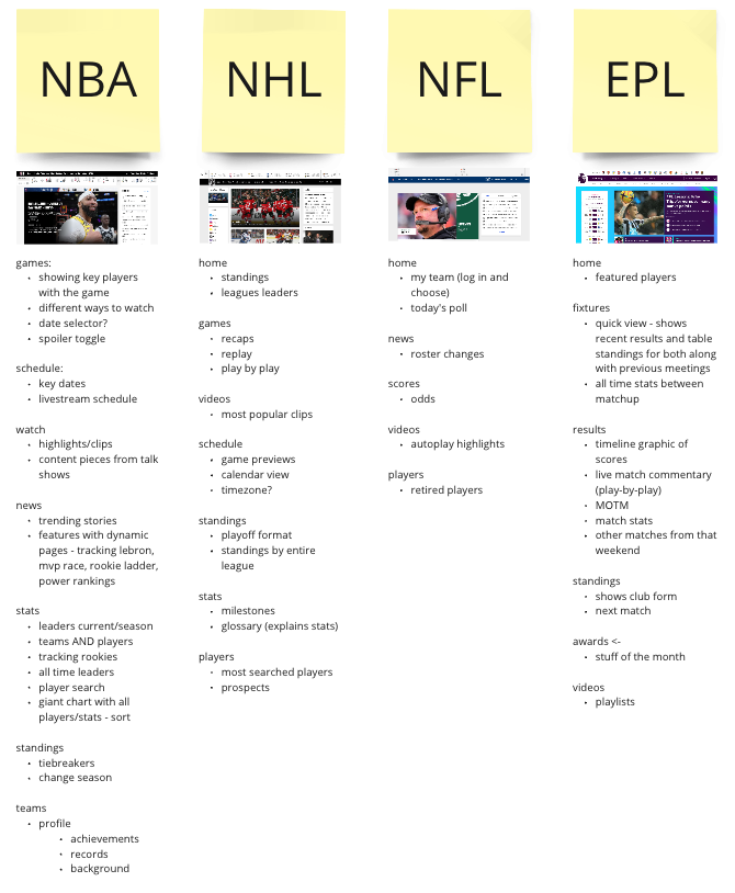
While looking through these websites, I documented noteworthy features on Miro that could potentially translate to some way in Rocket League.

With the list of ideas, I combined all the overlapping aspects into a single list that covered what was interesting to me.
Games
  • key players
  • different ways to watch
  • date selector
  • spoiler toggle
  • recaps
  • play by play
  • recent results
  • team comparisons
  • replays
  • odds
  • stats
  • Man of the match
  • other matches from same weekend
Schedule
  • key dates
  • livestream schedule
  • game preview
  • calendar view
  • time zones
Stats
  • current leaders vs total over season
  • team stats and player stats
  • all time leaders
  • player search
  • glossary that explains stats
  • milestones
Watch/Videos
  • highlights/clips
  • content pieces from talk shows
  • most popular/trending
  • playlists
News
  • trending stories
  • dynamic pages - tracking stats, rookie ladder, power rankings
  • roster changes
Standings
  • tiebreakers
  • change season
  • playoff format
  • compare to entire league
  • show club form
  • next game

That bullet list helped me realized that I wouldn't be able to accomplish everything.

This project was a school project so I knew I wouldn't have time to do everything that I wanted to.
website
in-game
In an ideal situation, Rocket League would have a website that complements the game.
I figured a good business solution to the problem would be using the game client to draw people into RLCS, and have a more feature packed website where diehard fans can go for all the other stuff they need. Websites are more practical to update and access also, so I didn't need to put everything in the game.

Here are the most important aspects I wanted to focus on in the menu system.

1.
Showcase the high level of play involved in RLCS
"When I watched for the first time, I didn't even know that stuff was possible"
- Friend new to pro Rocket League
When talking to friends who had occasionally watched RLCS, the part they said drew them in the most was how good the players are. The skill ceiling in the game is very high, so for lower level players to watch RLCS, it can be revelational sometimes.
2.
Understanding when the next set of games are
Rocket League currently has a button that appears only when games are live; however, you have no idea when the button is going to appear if you don't follow the league. By simply advertising when Rocket League will go live next, people can at least plan in advance to watch the games.
3.
Give fans something to latch on
Something very unique about esports is that an organization may have teams in multiple games. For example, G2, a very popular esports org, has teams in League of Legends, CS:GO, Valorant, Rainbow 6 Siege, Rocket League, and Fortnite. Anyone that's heard of G2 in some other games should be able to come and support them in RL also.
4.
Track progress of teams
People like to support teams that are doing well, so by highlighting the teams that are winning, casual fans can be drawn into them. This menu system should also serve as a way to check in with their favorite teams and see how they're doing, even if there's little investment in RLCS
5.
Highlighting teams from all the regions at the same time
Fans are pretty good at paying attention to their own regions. Since North America and Europe make up a very large portion of fans, the other regions such as South America, Middle East, Asia Pacific, etc. don't get as much attention. I wanted to use this menu as an opportunity to place information for the major regions (NA/EU) alongside the others so they would get more exposure, popularity, and respect among fans.

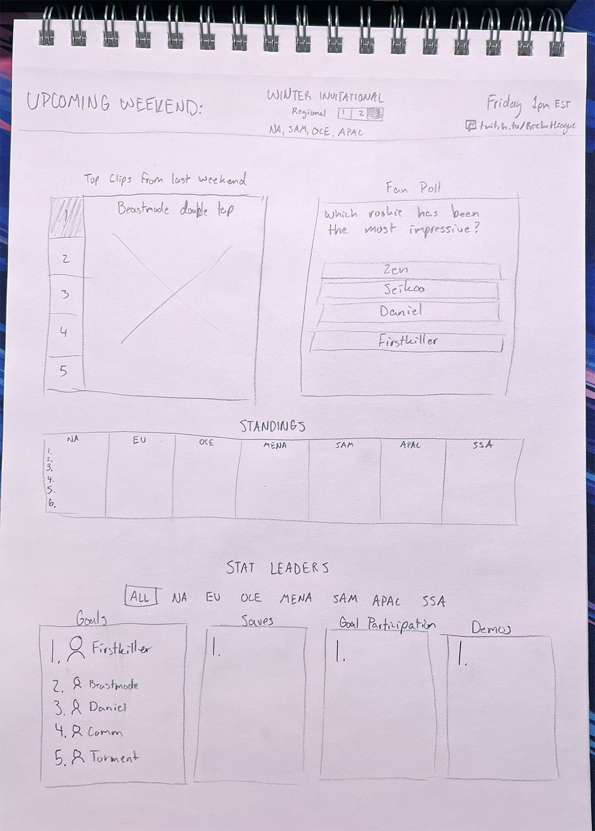
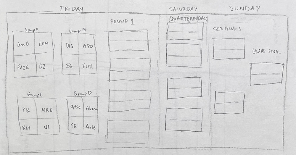
Here's the initial sketches from the 5 aspects.

main landing hub
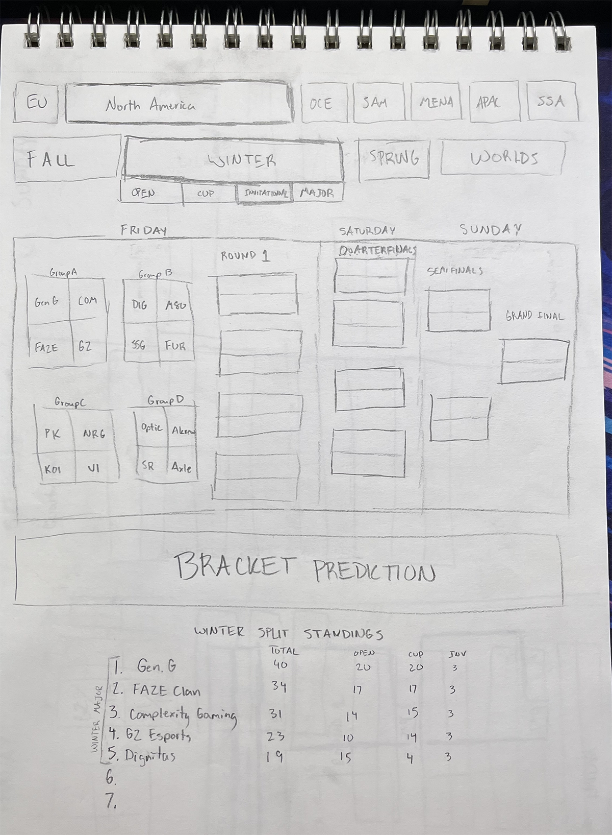
tournament page

To get feedback on the sketches, I showed them to other students and casual Rocket League players.

Through feedback, I realized a few things...

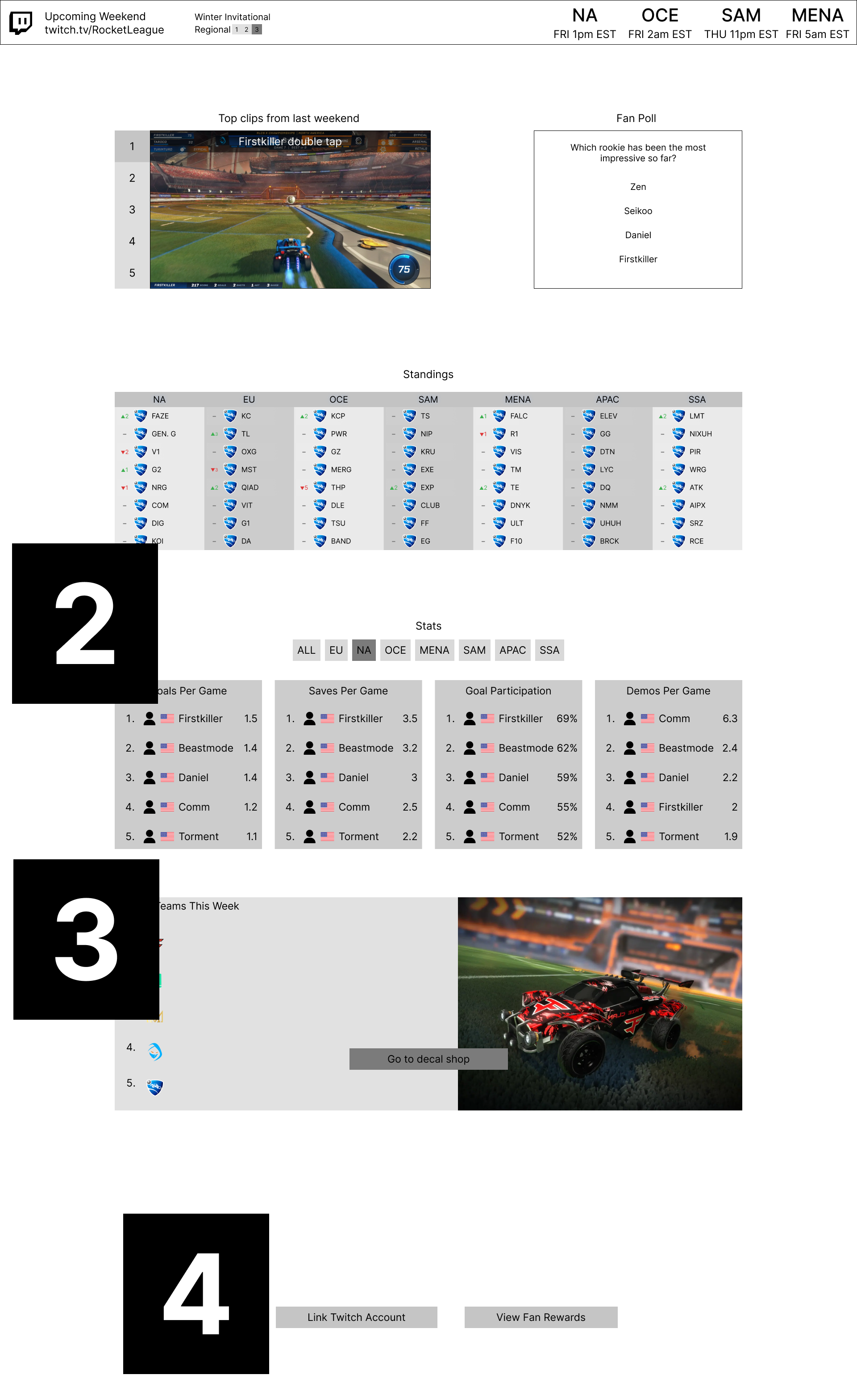
With the feedback, I moved to wireframes to see how sections in the sketches could be formatted.

sketch
wireframe
The feedback from directly before that applied were:
  1. Listing out each time for the different regions of when the broadcast starts
  2. Added spots for flags next to each player
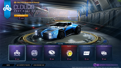
  3. Added a space for a link to the item shop to buy esports decals
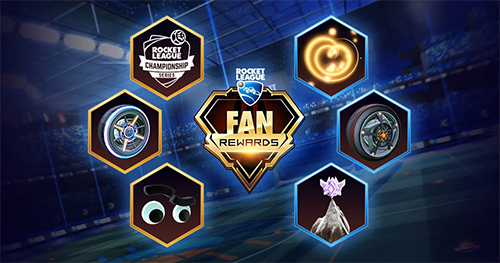
  4. Allocated space at the bottom for fan rewards to be mentioned and buttons for linking the accounts and viewing the rewards
sketch
wireframe
I tried coloring the sections differently to help separate them out conceptually since each level was a different thing. I also added space between the "MAJOR" and other three events (the lightest blue) under Spring to better separate them conceptually.

Due to time constraints, I moved straight form wireframes to the high fidelity versions.

At the beginning of the project, I didn't plan on moving to high fidelity much, but as the project went on, I realized I wanted something that not only tested my UI skills, but could be something interesting shown to the Rocket League community as a potential idea.

Design Walkthrough

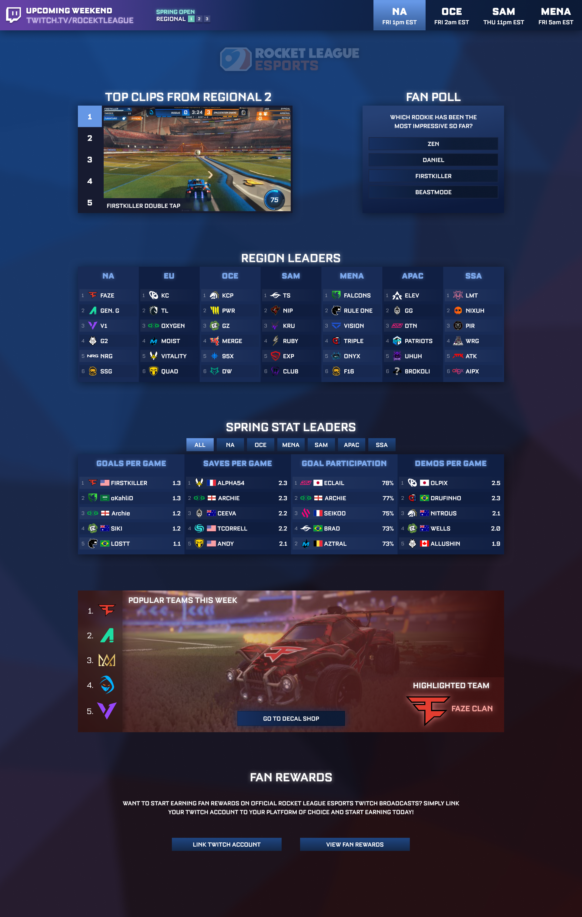
Promoting the upcoming weekend

Not many people in the scene know what Cup, Open, and Invitational mean. By including Regional 1, 2, 3 directly underneath it - people can easily tell it’s regional 3/3 which means it’s important because the Major is next and people are fighting for qualification.
Accessing the tournament page happens through this bar and when you visit the page, North America is automatically selected which gives easy access to those who already plan on going to the tournament page, since it will probably have high traffic. The other regions are right next to NA to promote some exploration into those regions and see who’s involved.

Engaging Fans

Like mentioned earlier, one of the main goals of this hub was to showcase the high level of RLCS. Low level casual players are very impressed by skills of pros who have thousands and thousands of hours in the game. By giving access to not only the level of play, but the hype that comes with watching them and listening to the commentators, people can start to take an interest.
For those that do keep up with RLCS, there is a poll to keep fans thinking about what’s going on and potentially spark discussion on Reddit and Twitter - where most of the discussion happens. This can create a link to draw casual fans to the forms of social media where a lot of other stuff happens.

Highlighting teams from all regions at the same time

A focus for developing the scene is drawing attention to the minor regions. Although people will mostly only be interested in NA/EU, it’s in Psyonix’s best interest to develop the entire scene, not just the popular ones. This portion of the hub makes it easy to track the region you care about, but also pokes some of your attention to the other regions. Most probably won’t care, but some might notice interesting teams pop up and decide to tune in just to watch them.

Giving fans players to root for

This gives a chance for fans to recognize players from streams or youtube content and follow up by supporting their teams. People can also connect a team to a player just because their name is interesting or their nationality.

Giving fans teams to root for

Players in Rocket League care a lot about the aesthetics of their car designs. There are players that buy decals of teams they don’t support just because the decals look cool. By highlighting the decal shop, players can learn to start supporting a team just because they’ve been using the decal and want to become more engaged.

Motivating people to watch the Twitch streams

Rocket League already has this exact same copy on their esports website, but no one uses the actual website, so I wanted to bring attention to it here. Many people watch the streams just for the in-game items you can get as rewards. By showcasing them here and making them accessible in-game - more people will be i to make that initial tune-in.
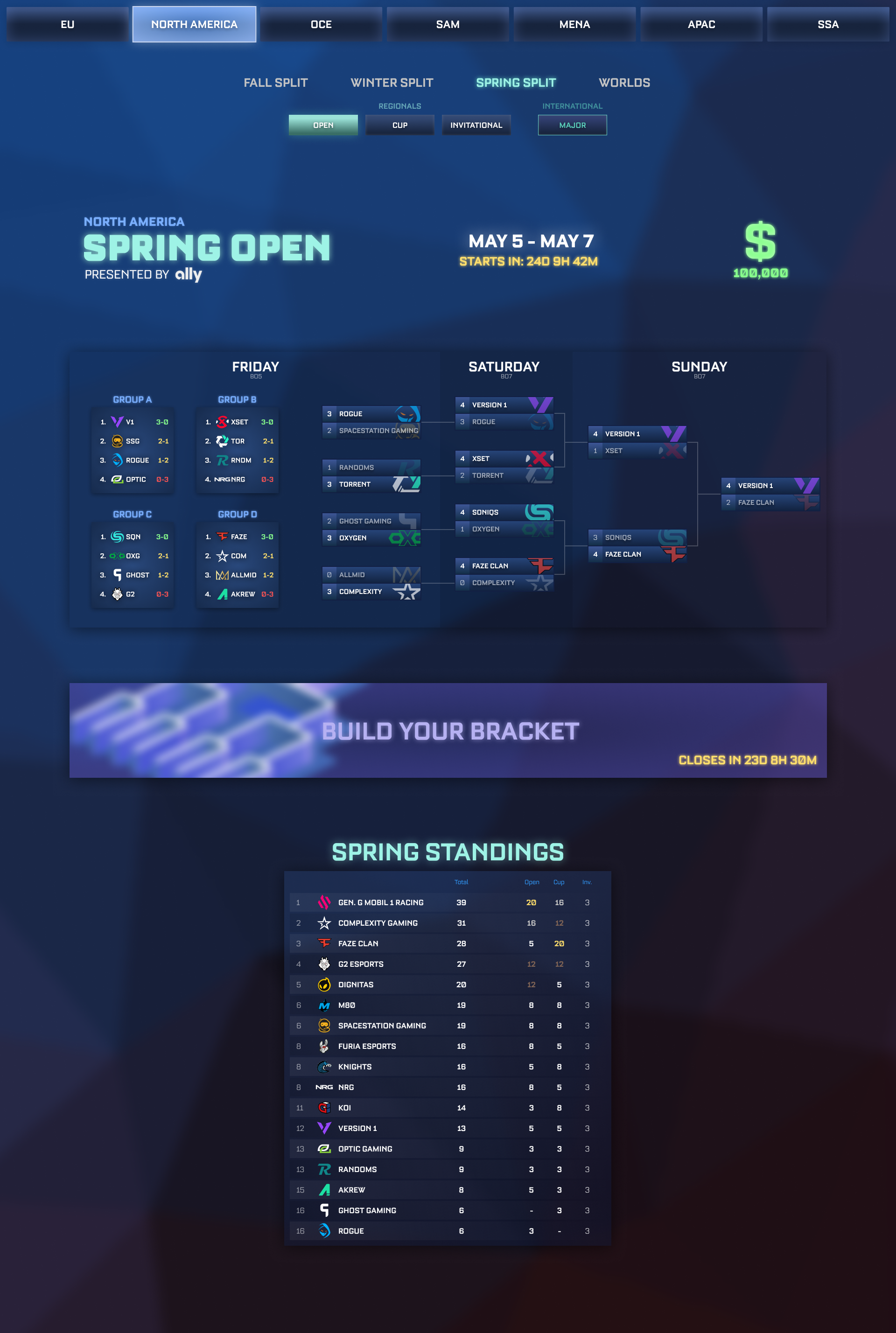
Easy access to all regions/tournaments

By making it easy to flip around into other regions and random tournaments, casual fans can get a sense of the scene for what teams usually perform better than others. Since there’s a prediction mode later down, they can look at other tournaments to make better educated guesses. This feature is also important for dedicated fans who come in to regularly check results that they may have forgotten about.

Tracking the individual series

To help fans keep up with their favorite teams, they would be able to keep track of the team’s progress game by game. With future iterations, more information would be available for each individual game inside the series. Because this screen is meant to be looked back on after as well, fans can see if their team did well after missing the games.

Giving fans a reason to tune in

Currently, it’s popular to predict how each tournament will go since there’s always a big lead up. People use community made google sheets to create their own bracket and then post screenshots on twitter. Although this works well and starts dialogue, not everyone can find those spreadsheets. By implementing a way to guess the tournaments in the game, casual fans may have an interest in neutral games just for the sake of wondering if they predicted the right team.

Giving new players context to the league

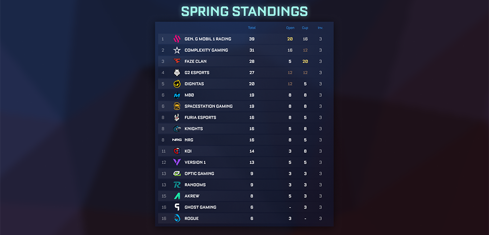
Showing the league standings with the bracket itself gives some background to teams that are above. By comparing the results of a tournament with the standings, you can find teams that did way better than expected, or teams that completely bombed out. This makes the results more interesting and also better helps people go through the prediction mode.

Testing an interactive prototype didn't reveal many additional insights

After the design was complete visually, I added interactive capability through Figma’s prototype tools to test its navigation through a controller. I wanted to test the navigation digitally rather than with a physical prototype to test people’s initial reactions with button input. I felt like people would have too much time to think about what they would press with a physical prototype, that people might incorrectly guess which button they’d actually press once it’s on a screen.
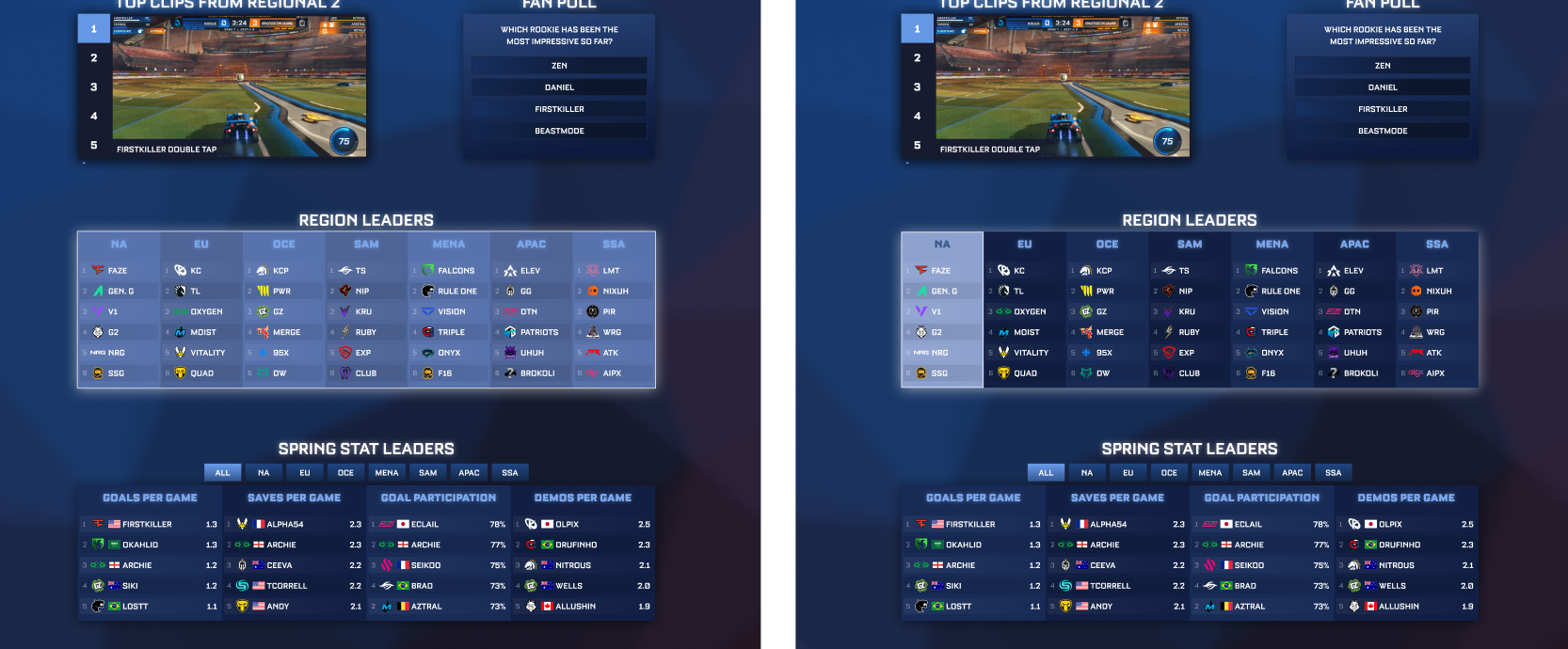
Testing with Figma didn’t go as smoothly because the prototype was slow on a couple people’s computers so there was an even longer delay between inputs. The one main thing I realized I needed to reconsider was what selections were grouped together vs individual.
For example, when navigating, the entire Region Leaders box would be selected, and upon pressing select, it would move to an individual box for NA. However, vertical navigation isn’t interrupted by the initial step being taken out because there’s only left and right selections. 

Other than that, there were no real complaints which is understandable based on the design. It’s not complex at all, and would take very little getting used to if it reacted instantly in a game engine.  

Community Feedback

A long time after I actually designed the screens, I posted the UI concept on the Rocket League Esports subreddit. Here are some of the comments from the post.
Reflection
Looking back, I made this project much more difficult than it needed to be. I had lots of ideas in the beginning of what I could do, but never settled on moving forward with something, and went back and forth on minor details. It ended up hindering the amount of stuff I could cover. I wanted to make a bigger ecosystem for the in-game menus, but it was hard to choose what was worth my time and what wasn’t - not just because of what would be effective, but things that initially seemed too simple. For example, I know that pressing on the stats would lead you to another screen where you can explore them more in-depth. However, I didn’t make it because I’ve seen so many successful statistics done on websites I didn’t feel it was necessary to try and make one here.

It also makes me think about how I probably made this too similar to a website. This was designed for a video game, so it has the freedom to be a lot more interesting than what I made. I’m happy with the UI matching Rocket League’s theme, but I don’t know if it matches the mechanics of menu functionality quite the way it should. I wish I made things a bit more fun and over the top by expanding each section more and adding more spice. The problem I figured with that is it starts to involve more graphic design which isn’t my specialty. I think if I was more comfortable with higher fidelity sketches, that concept would come easier which is something that might be a learning goal for the future.