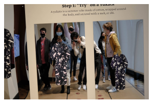
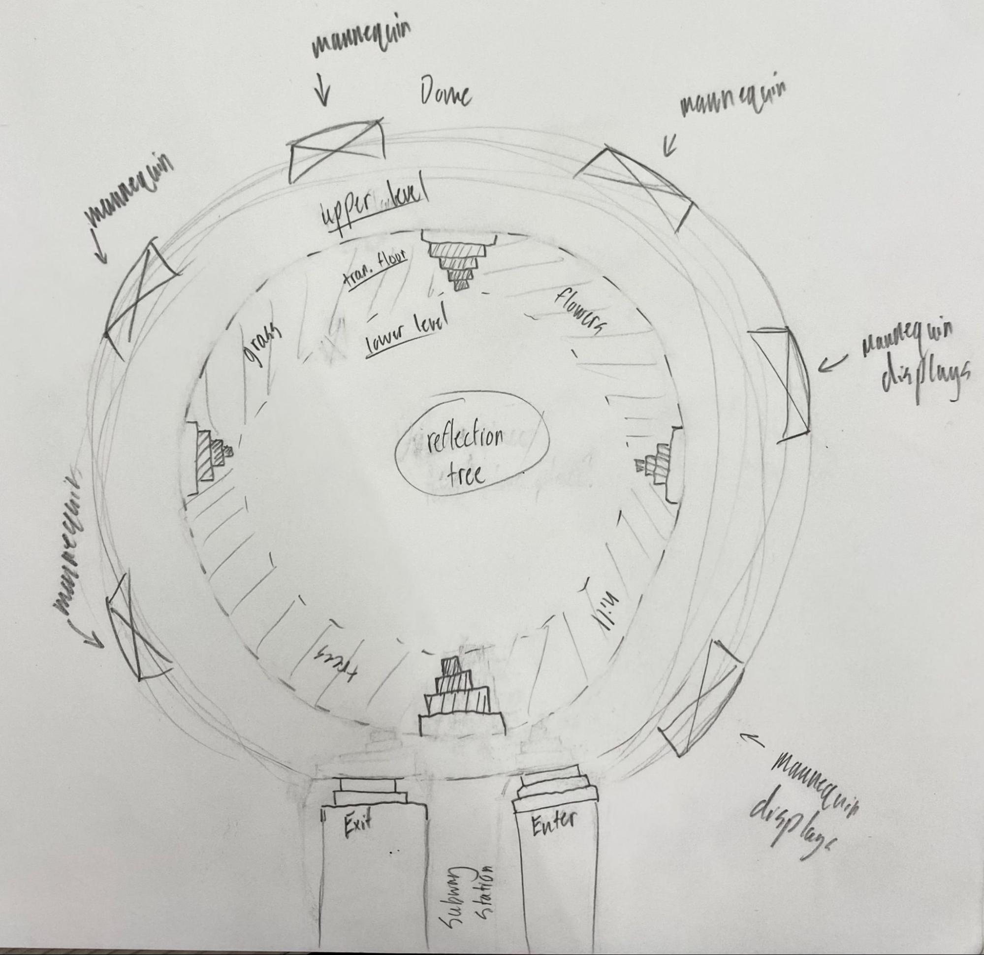
Interactive Cottagecore Fashion Museum Exhibit
Project Brief: Create a museum experience based on a period of design while including multiple physical and digital touchpoints.
Team Size: 6 People
Project Length: 6 Weeks
Cottagecore is an aesthetic that represents escaping from society into the rural lifestyle. Although our project was on fashion specifically, it represents much more than clothing. Cabins in the wilderness, baking, and gardening are all parts of a normal life back in the 1700s; however, it’s been idealized in current times as a way of getting away from technology and stress. I use the word ‘idealized’ because people only take the parts they like from it rather than the realistic lifestyle that comes with living before the age of technology.
Our group used this as an opportunity to explore how modern day cottagecore is linked to history and how escapism can take place through its fashion.
Examples of modern day cottagecore
Understanding how people experience peace, tranquility, and escapism in everyday life
To get ideas on how our museum exhibit could represent escapism through fashion, we first wanted to understand how people can experience this in a general sense without fashion. Our team created cultural probes in cute little paper bags to send out to friends.
The probes included the following two activities:
1. Mood board - Use the included magazines, glue, and paint swatches to visualize a time you felt at peace

Finished boards:
click to expand
2. Moments of Peace - Use the included magazines, glue, and paint swatches to visualize a time you felt at peace

Pictures taken by participants:
The biggest takeaway we got from the cultural probes is that nature is the biggest source of peace & tranquility. This meant that we wanted to base our museum on a design that feels peaceful to be in even if you aren’t interested in fashion.
Gathering inspiration from exhibits around the world
With a direction in mind from our cultural probes, we wanted to get some more specific ideas of how modern exhibit arrangements and interactions play into the experience. An annotated portfolio was created by some of my teammates to assemble bits and pieces we might want to incorporate into the design.
click to expand
Here are some of the main affinities we pulled from the portfolio:
Tactile Interactions
Activities are more engaging when you get to physically interact with them. They should also be playful - something that gives participants some freedom to do what they want.
Reflection Areas
There should be places to rest so that people are encouraged to think about what they’re interacting with.
Promote Exploration
There doesn’t need to be a set path/order that exhibit parts need to be followed. Let people go wherever they want and it should still make sense.
Setting the goals for our exhibit
With a theme and general ideas, we set these two points as main objectives for our museum to accomplish
1
Illustrate escapism through cottagecore fashion
2
Showcase the historical influences behind cottagecore
Picking clothes is more than an aesthetic choice; it says a lot about who you are as a person. We want the exhibit to show people the significance of this modern trend and that there is more to it than likes on Instagram.
This plays into the idealization that was mentioned earlier. People remove lots of historical context that surrounded the fashion style when it was the norm. We want to link its origins to styles nowadays to people can see this specific connection as well as critique the origins of other fashion styles to show that design gets recycled.
These goals allowed us to think of the following touchpoints that would work towards accomplishing the above
1. Interactive Closets
Throughout the museum, there are several pockets of space dedicated towards one cottagecore outfit each. These are all meant to be replicas of dresses that would’ve been worn in the 1700/1800’s. Here, museum goers can learn about the specific outfit and some historical background towards it.
There are also fabric swatches in each closet that make up the outfits. Guests are encouraged to take them for the next touchpoint where they can interact with the swatches.

The main purpose for the closet is to juxtapose the old outfits with modern ones so people can subconsciously draw the connection between the two and create a sense of exploration and interactivity by allowing people to take the swatches with them.
2. AR Mirrors
One of our earliest ideas was letting users try on real, physical clothing - not surprising considering it’s a fashion exhibit. However, we realized that this posed safety, inclusivity, and logistical issues which turned us away a bit. The idea of trying on clothing was still engaging though, so we drew inspiration from a touchpoint at the Newfields Museum in Indianapolis - class field trip :) - where a Japanese Yakata was attached to a mirror. This allowed you to see yourself in the outfit with the reflection.
The final iteration of this idea was an augmented reality mirror that would superimpose cottagecore outfits on the person through AI. Instead of putting these mirrors in the closets, we created a separate space almost like a fitting room where all the mirrors would be together.
Each mirror has a touchscreen that guests can use to choose their outfit, but they can also use the fabric swatches from the closets to start their outfit. Connecting the two makes the museum exhibit a more playful experience since people have some ownership instead of a cookie-cutter flow. People are encouraged to go back and get more as if they were shopping to experiment with outfits and have fun. The swatches also create the connection between the historical influence of the old dresses and modern dresses.
3. Sound Garden
This touchpoint started off as a way to get museum guests to reflect on their experience with questions hanging from the tree that people could answer on digitally. We didn’t like how direct it was considering it was a public space, and most people don’t even reflect this way privately.
We settled on using the touchpoint as a way purely to relax and promote either reflection on the exhibit, or what they were planning on eating later on in the day. It is partially a digital experience however - when guests sit on the benches, the area around them reacts to it. Digital flowers begin to bloom and subtle nature sounds start to play. This was heavily influenced by our moodboards from earlier on where we found nature is people’s biggest sources of relaxation and peace. The touchpoint allows people to further disconnect from reality which promotes the theme of escapism in cottagecore.
With the touchpoints set, we just needed to figure out a way to connect them via the exhibit layout.
Sketch #1
Sketch #2
Sketch #3
Sketch 3 was chosen by the team as the basis for our final layout. The circular design promotes exploration and lets people easily go from one area to another which removes a set path anyone needs to follow.
This sketch represents our final design very closely. We also decided to add a “Cottagecore Overview” section to inform people less familiar with the trend about it (i.e. if someone takes their partner to the museum). The interactive closets are placed on the top floor while the AR Mirror and Sound Garden are placed on the bottom floor. The separation makes the first floor more of a learning space while the bottom floor is more engaging and interactive.
Final Design
For a full walkthrough of the museum, check out this awesome video made by one of my teammates, Titan Hoang.

Entrance to main part of Exhibit - Subway

Subway replica that is for show only - Visitors walk straight to the exhibit at the end
Arrival
The exhibit starts in a subway station replica which symbolizes the stressful, city lifestyle that many people are familiar with.
Departure
Museum visitors also exit the exhibit through this area (on the other side of the train) which makes the exhibit feel like a mini trip into escapism, creating a stark return to reality at the end of their visit.
Transition
The transition from the subway to the main part of the exhibit creates a juxtaposition that represents the escapism of cottagecore.

Main Area

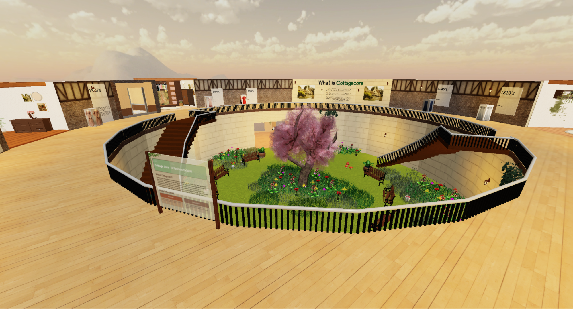
Two level open area with a sky projected onto the ceiling.
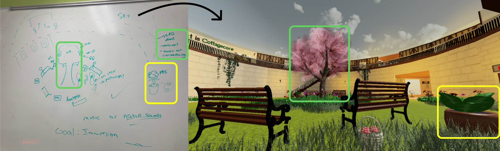
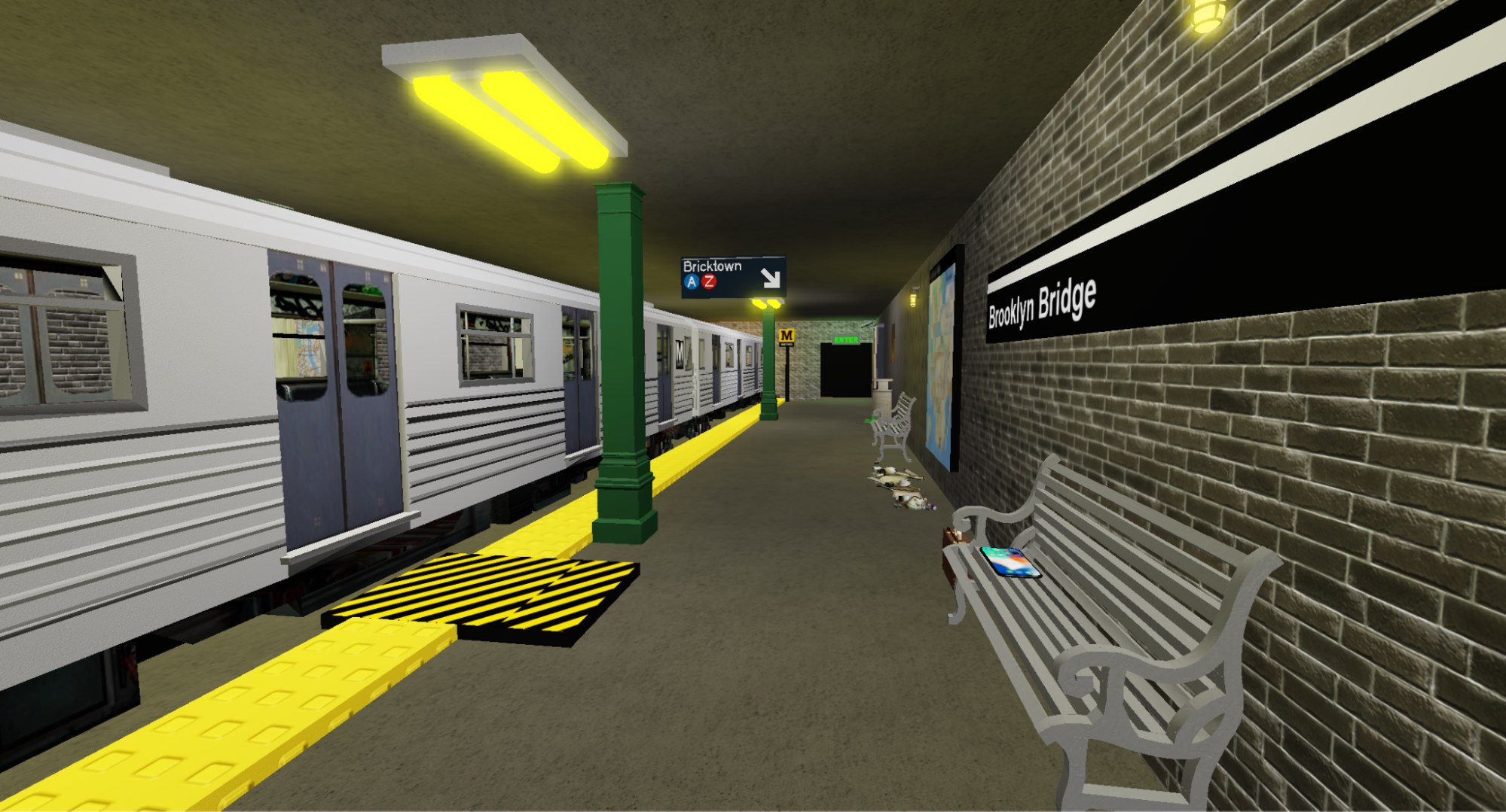
Contrast
The shift from the loud, busy, and dark subway system to the light and open dome covered in sky is a pretty jarring one to surprise and excite users, but more importantly make them feel like they’ve escaped their city lifestyle and entered a peaceful and serene atmosphere.
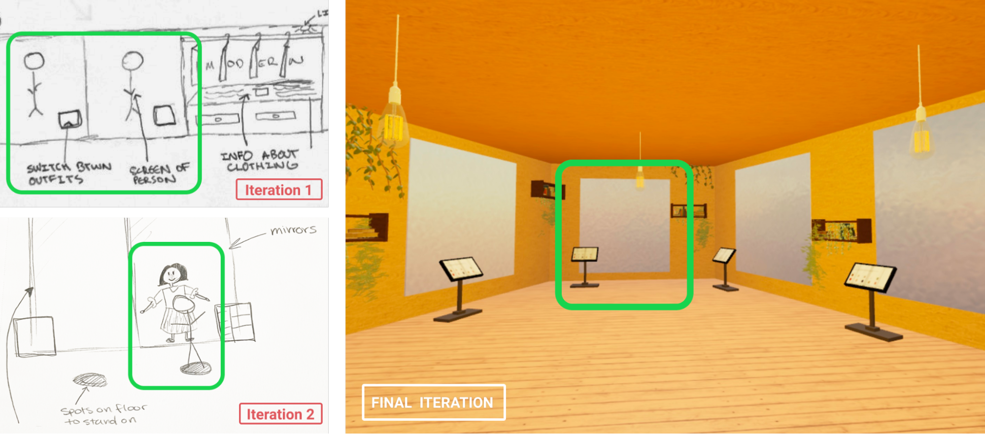
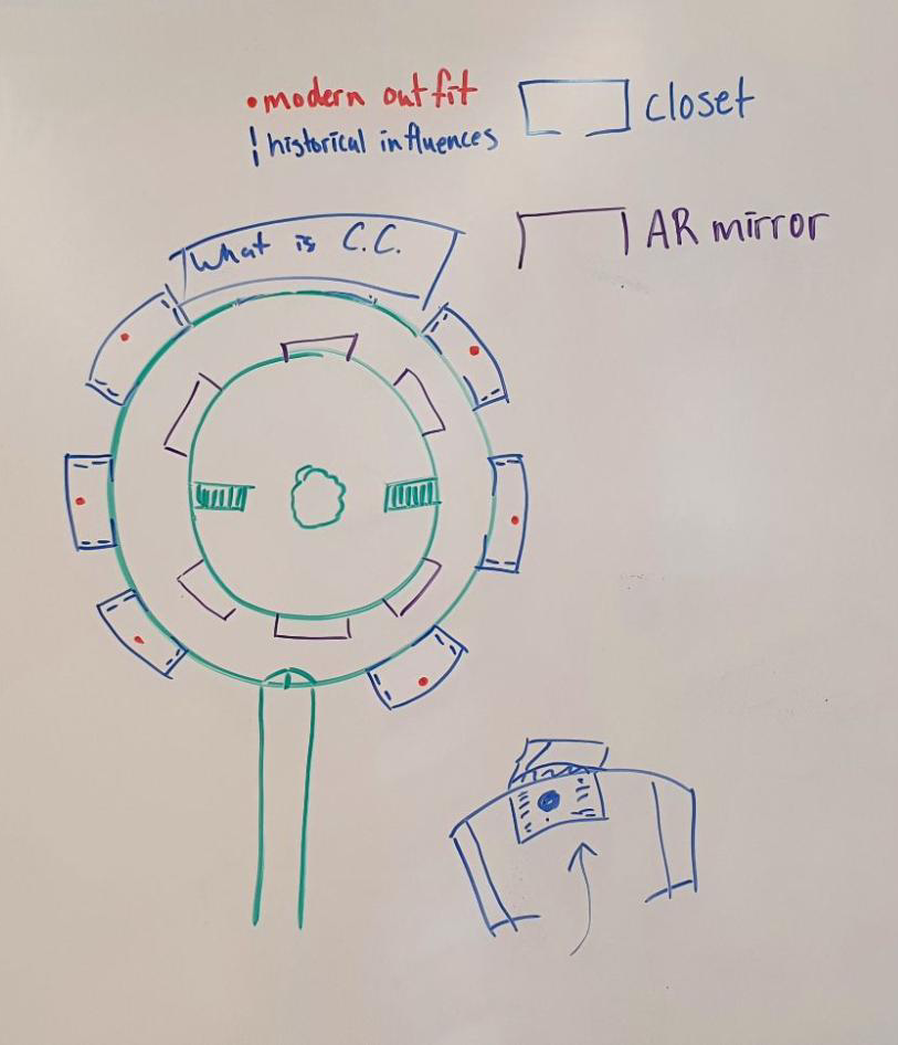
Open and Separated Design
The first floor serves as more of an educational one so that people get some context before moving to play with the interactive and immersive pieces on the bottom floor. However, the open design allows people to stay on the first floor for as long or as short as they like, and gives them easy access to the ground floor when they are ready to move on.
Reflection
A lot of UX work gets done in the digital environment - creating mobile screens and websites. This was a totally different project that was based around the spatial environment and showed me a whole different side of UX. I came from web development and design before UX, so this contrast was super fun to experience.

Our team also used Roblox Studio to create the prototype - a tool I started using probably in 7th grade. Roblox was a big part of my childhood and I used it to create things from cars, stadiums, and houses to interfaces and fun button animations. It was awesome to now use it for UX and with the team also who learned it during the course of our project.